Less is More: Why You Need to Simplify Your Exhibits
Thursday, March 15, 2018 1:00 PM by Grace Carroll in Design and Planning
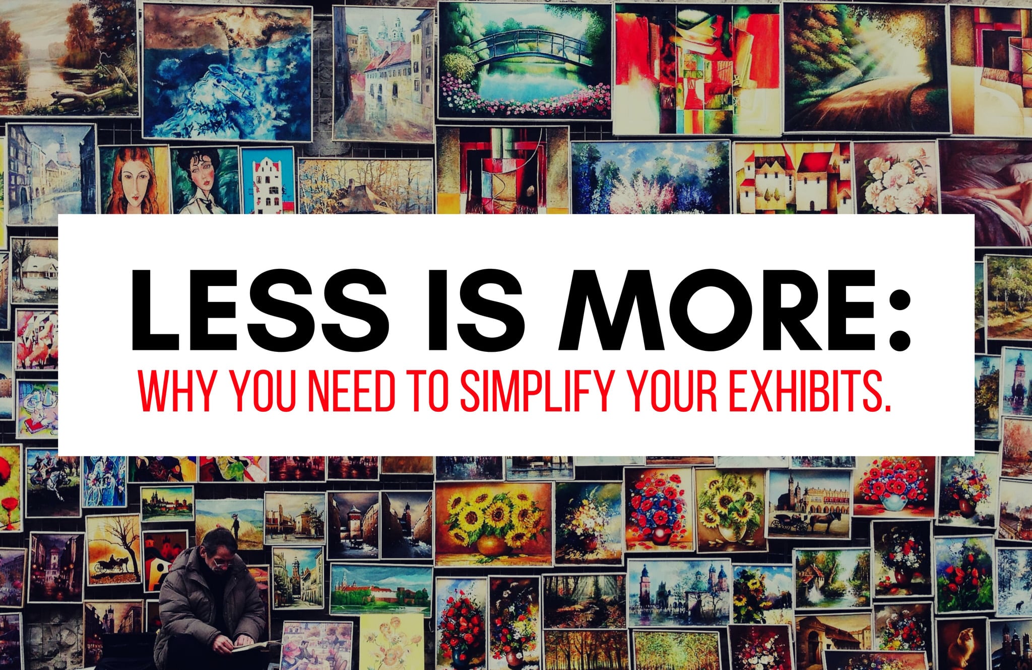
Empty space may just be one of the most powerful and simplistic design tools. Yet it can often be overlooked in exhibit design. Why is it that we are comfortable with the idea in drawings, paintings, graphic design, and even interior design, but in exhibits, we get a little uneasy?
The concern might stem from the definition of negative space itself…empty space. Empty space sounds useless and boring. In exhibit design there is a precise amount of space to tell an entire story, communicate a message, and share objects and artifacts. That space is often seen as too valuable to lose even an inch to “empty space”. It makes sense. But the truth is, as scary as it might be to “lose” space for emptiness, the positive impact it has on visitor’s ability to absorb information is too powerful to be overlooked.
Exhibits that fill space wall to wall have no focal point; everything becomes the same level of importance. If this is the intention, such as salon style galleries, go for it. However, if there is an object or message that is meant to be the focal point, it needs a way to stand out. Negative space is the answer. Simply start deleting the information around it that is trying to steal the spotlight. This doesn’t mean that what you delete has to go away entirely, maybe just moved. Think of negative space as a way to enhance the positive space.
Content needs room to breathe and so do visitors. Negative space creates a space to think. Scroll through these images for a visual example. Sensory overload can be overwhelming, contributing to museum fatigue and disinterested visitors. Empty space can revive and create a moment of calm before the next moment of wow! This can be in the form of a dedicated physical space, a primarily blank wall or even a text panel (light on the text) that prompts a pause to reflect. Negative space is a way to maintain balance. The entire experience can’t be the finale of a fireworks show; the moments of nothing before the next boom give us time to relax, recap with our family/friends, and grow in anticipation.
Ultimately using negative space is visual editing. Similar to editing in writing, we are looking to eliminate content that is not necessary to the overall message. This can be very difficult, once you feel close to the story every detail can seem extremely important. Ask yourself, would deleting some of that peripheral information have an effect on the strength of the overall main idea, mission or central theme? Will its deletion create valuable negative space to elevate another object or idea? Could it create a moment for the visitor to pause and reflect?
Embrace the empty space. It might not be comfortable at first, but it might prove itself useful. And if it doesn’t, you can always fill it back up! Do what is best for the story. Rest assured that negative space is in your design toolbox to help you!
Share this on social networks
 Back to blog posts