8 Simple Ways to Increase Visitor Engagement
Wednesday, October 1, 2014 3:47 PM by Betty Brennan in Professional and Industry Tips

I am sure you have all heard of the KISS principle. Keeping things simple is more effective. This certainly applies to technology and storytelling in interpretive exhibit design. A couple weeks ago, I visited King John’s Castle in Limerick, Ireland. They recently installed six million Euro of new exhibitry in this 13th Century Castle. This new visitor experience is the cornerstone and start of Limerick’s development plan to become Ireland’s first City of Culture.
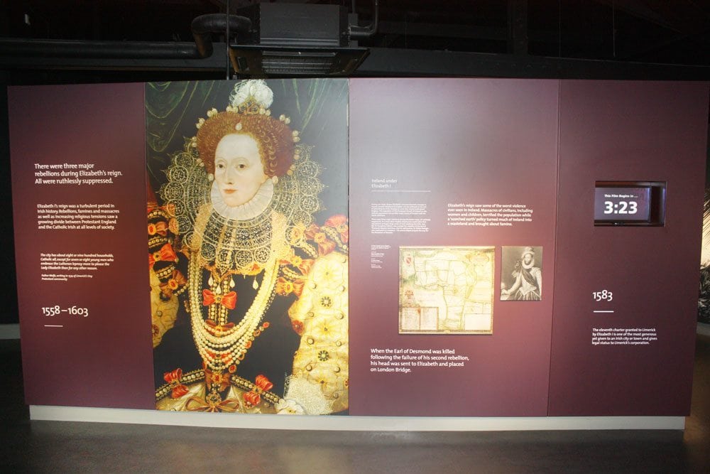
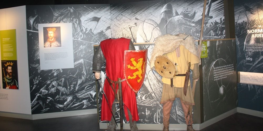
Upon entering the exhibit galleries, the juxtaposition of technology and an ancient site was palpable. There is loads of technology strewn everywhere. I was immediately struck by the exquisite illustration work on the graphic panels. Unfortunately, I was also confused about the central theme and story lines. The graphic headings were helpful, but not organized in such a way that I could get my head around some of the basic facts. The biggest hurdle for me in having an engaging educational experience in these galleries was the noise level of all the A/V components.
The video technology used throughout the castle was magnificent in its production. There are personal stories from the various trades and positions from a mason to a moniker. These videos are very well done. They were also long. I started to watch other visitors to see if anyone was watching them all the way through. Most of these monitors did not have viewers standing in front of them. Visitors were drawn to the 3D replications. The scale model of the castle had a crowd standing around it. Many visitors stopped to look at the 3D model of the building of the castle. Isn’t it interesting that with all the high-tech exhibits the most engaging element drawing the most attention was the old fashion diorama?
After 23 years of interpretive exhibit design and fabrication experience, I have a critical eye. I think this is a bit unfair in my review of these exhibits. All in all this is an incredible site to visit and I would highly recommend you go if you are in Limerick. However, I can’t help but think of the KISS principle and if some rules of interpretation were applied to this site the experience could be even more engaging.

How to Increase Visitor Engagement
Make it Aesthetically Pleasing
The artwork and graphic panels were beautiful. Beauty in design helps draw attention. The trick is to make it beautiful and functional. In the book Emotional Design they discuss the many elements of why attractive things work better. They discuss the scientific evidence that attractive design and the emotional response they evoke also helps in cognition and functionality.
Keep The Noise Level Down
Make sure audio does not spread. Turning off or turning down these audio experiences would be incredibly more effective. The noise level in the castle exhibit gallery caused anxiety to rise.
Keep it Short
Brevity is key to a good visitor experience. This applies to audio/visual components and length of copy on graphic panels. The A/V components at this castle were way too long to engage visitors. It was rare to see someone watch one for any length of time. Yet one hallway experience that had a few words and projections on white walls was a very effective use of technology. They kept it simple and it was impactful in transforming you to another time and destination.
Make All Headings Stand Alone
Many people will just read the headings on graphic panels. Make sure your headings tell a story in themselves. The headings at this exhibit were insightful.
Organize the Content
Much of the content at this experience was disjointed. There was no table of contents, overarching timeline or consistent theming that gave context. If they had added a large date panel at each point, a color code or some type of theming to denote how the content was organized it would have been more pleasurable.
Don’t Make Where to go Confusing
This relates to organizing the content too. If as a visitor you don’t know if you should go left or right or into a certain theatre or nook, it becomes a frustrating experience. Having a choice as a visitor is fine. You just need some knowledge of what you might be missing if you choose a certain path. When walking the grounds of the castle it also wasn’t obvious where you could go and what you could see. An overarching map on each exhibit panel would have been helpful.
Use 3-D Models to Help Tell The Story
I saw the most visitor use around the scale model of the castle and the diorama depicting how the walls were built. Old fashion models are very engaging to visitors and tell the story without words.
Good Design is Intuitive
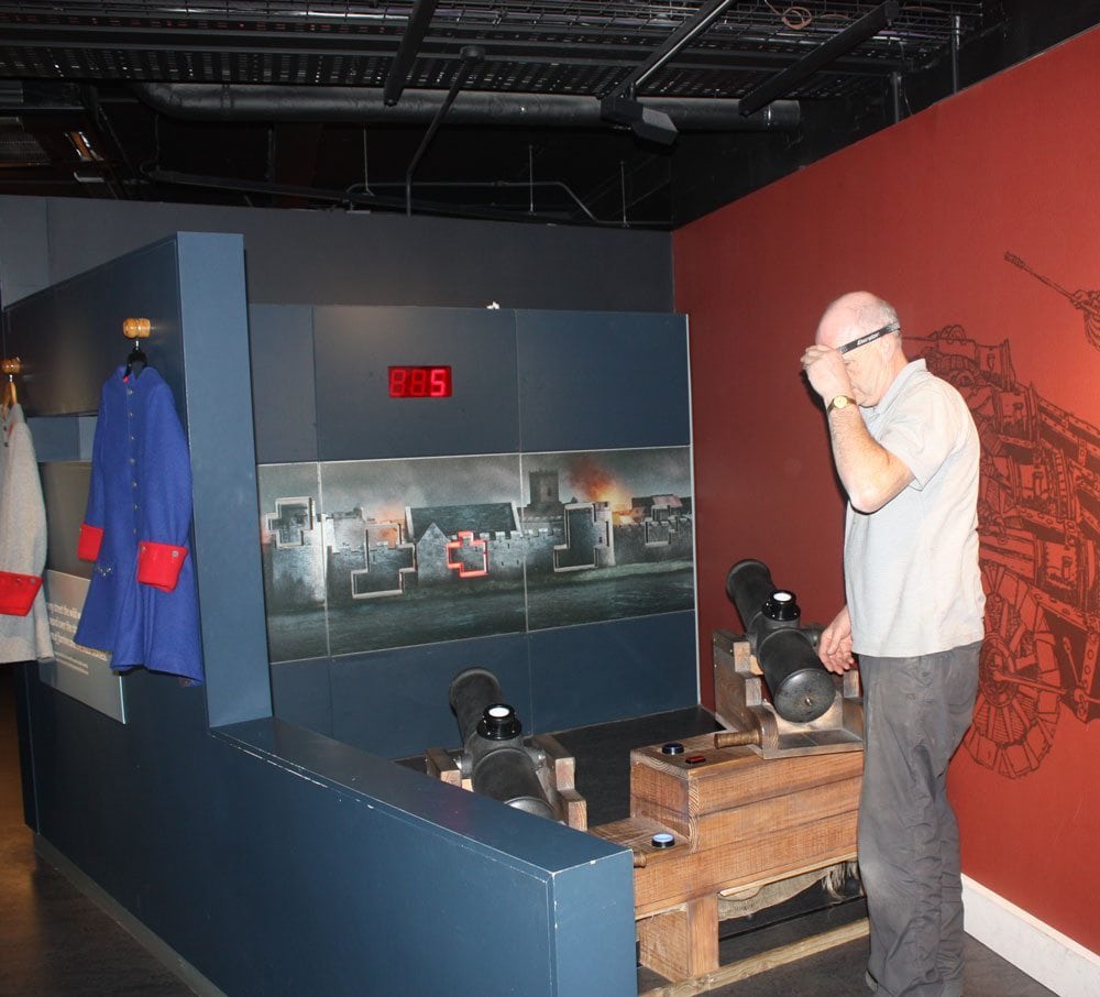
If you have to add signs that say things like, “lift this” “go here” “press this” it isn’t intuitive and not as effective. Make sure it is obvious what you would like the visitor to do. For instance, they had an interactive cannon off in one corner. Its placement in the gallery and how to use it made no sense which caused confusion.
Creating pleasurable, engaging, educational and impactful visitor experiences may not be as simple as it seems. Yet if we keep the KISS principle in mind we may be more effective in creating inspirational experiences.
Now it’s your turn. Tell me about an exhibit you visited that seemed overly complicated.
Share this on social networks
 Back to blog posts