DIY Museum Graphics
Thursday, March 17, 2016 9:02 PM by Taylor Studios in Professional and Industry Tips
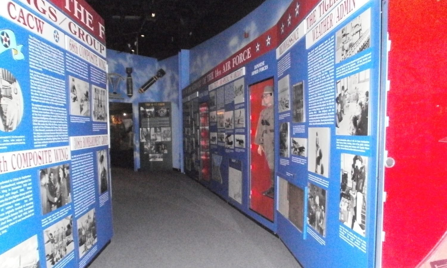
YOU can create effective interpretive graphics for your facility, even when your budget is small or you lack design resources! We are often challenged with telling a story and redesigning a space that is home to 10+ years of exhibit build-up’ beat-up taxidermy, old graphics, broken interactives, dated materials, etc. Many folks add new material to their offerings one parcel at a time. These “new” bits of information are often paired with a laminated photocopy or a printed word document offering their visitors information. Before you jump to Word or Publisher, ask yourself: Do graphics serve as a unifying interpretive staple throughout the space? Or do they detract and distract from the message at hand? Do visitors read them?
Here are some simple Do’s and Don’ts to help you tackle this challenge on your own:
DO
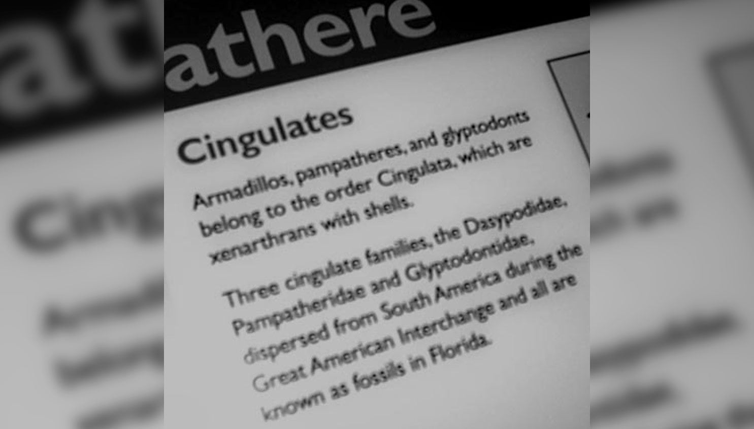
Use the KISS principle (Keep It Simple and Straightforward) – no more than 50 – 100 words per graphic. Less is more. A simple black and white printout with a few sentences of text is better than a full-color poster crammed full of copy.
Get creative – network with local high schools and universities; they may be willing and able to donate some design services. Sometimes college-level graphic design classes can make a class project out of your needs, resulting in a win-win. The students learn and practice, and your facility reaps the design work for little to no cost.
Explore online options. Numerous freelance sites offer an opportunity to contract a designer based on your budget. Try Fiverr, Upwork, or 99Designs.
Make friends with local photographers for image resources. They are often willing to donate their services to nature centers, visitor centers, and museums.
DON’T
Use complex language. The public reads at a 5th-grade reading level. Align your copy accordingly.
Over-fill your graphics. Visitors are overwhelmed when they are confronted with a graphic that is filled to the brim with copy and images. Be concise both in text and image selection.
Hang your graphics way up high or too low. ADA reading range is roughly 28” – 66” from the floor. This is a suitable range for visitors of all ages.
Use decorative or distracting fonts. Stick with legible, easy-to-read fonts, and keep them consistent throughout your space. Pick an easy-to-read serif, such as Garamond, or a san-serif such as Arial.
Fill out this quick form to download a complimentary copy of our TSI Copywriting and Graphic Standards to guide you on your DIY graphics journey.
Online Form – TSI Graphic Standards
By submitting my information to Taylor Studios, I understand that may receive newsletters, promotional materials, and/or industry articles. I also understand that I may opt out at any time.
Share this on social networks
 Back to blog posts